Live Your Adventure

Introduction

The assignment was to find an original ad and create a new ad that corresponds with the ad campaign and also incorporates good design techniques. I found an ad campaign from Eddie Bauer which I really liked because of its play on words. Lets…EDDIE. SET. GO.

Original Ad

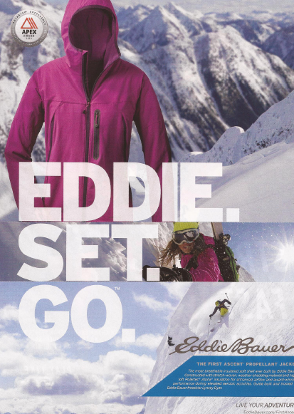
(Original ad location–https://mktg2350spring2014.files.wordpress.com/2014/04/eddie-bauer-post-4.png)

Target Audience

This ad is intended for men or women who like adventure and being outdoors. They want clothing that will help them enjoy their activities, not hinder their movement, and also protect them from the elements. Adventure is made better with the right clothing.

Newly Created Ad

Design Analysis

Typography

I incorporated a similar big, bold SanSerif Font as the original ad. This bold font draws the consumer’s eye directly to the catch phrase.

Alignment

I kept the same vertical alignment with the catch phrase and the jacket and also the horizontal alignment with the words set close together. In order to do this I needed to enlarge the kayaks picture, but reduce how much of the kayaks were visible.

There is also a vertical alignment with the skier and the logo in the original ad. To keep this similar, I found a picture of a kayaker angled down a waterfall and added that along with the logo and the product description.

Color

The white font matches the water from the waterfall. Though it is the same color because the font is big and bold it stands out from the backdrops of the picture.

The original ad had a pop of color in the pink jacket. I wanted to keep with that theme, so I included a bright color and found kayak pictures which included red and also added red behind the product description.

Slide Presentation

Please click on link to see the Slide Presentation discussing the Original Ad and the New Ad

Eddie Bauer Slides

Photo Used for Ad

To keep with the theme of outdoor adventure, I was thrilled to be able to find pictures that matched the vision I had for my ad.

Photo credit–https://pixabay.com/en/canoeing-dam-canoe-water-lake-2715776/

Photo credit–https://pixabay.com/en/colorful-kayaks-for-sale-water-1553246/

Photo credit–https://pixabay.com/en/kayaking-extreme-kayak-water-sport-1122520/

Conclusion

Overall, the new ad closely matches the Eddie Bauer Ad Campaign of EDDIE. SET. GO. I worked to include the elements of fun, boldness, and adventure through the photography, the typography, and color. My goal was to create an ad that clearly matched the phrase LIVE YOUR ADVENTURE.

Bringing the Natural World Directly to You

Introduction

This was my attempt to learn to use Photoshop by creating an ad for a liquid soap dispenser. The assignment required that I make it more symbolic and not literal, and be able to take separate images and combine them into one.

Target Audience

The audience is males and femalesage 25-34, who are single. They have a Masters or Doctorate degree and income over $90K and they prefer to read Magazines and Blogs. They like the life of adventure. The design of the Liquid Soap Dispenser will be simple, aesthetic pleasing and the ad will draw them into the wonders of the world which they have seen on their many journeys.

The Making of the Ad

As one of my favorite things is nature, my mind was naturally drawn to incorporating nature into my ad. I came up with three different sketches and then my finished product actually contains aspects of each of those sketches. It was tricky creating this ad, as I have limited experience at Photoshop, but luckily from my instructor’s videos and Google, I was able to figure it out.

Creative Ad–Draft

For my draft, I was so focused on eliminating the multiple waterfalls, as I only needed one, that I ended up with an unnatural side for the ad. The bubbles were added to create a fun element to the ad. The hard part was cutting out the images, especially the soap dispenser because it was sitting on a white counter and it blended in with it, so it was difficult to isolate it from the counter. The arm and hand was also a challenge to create a nice smooth cutout.

Creative Ad–Magazine

My revision incorporated feedback from my instructor and classmate. I extended the photo and with the cloning stamp eliminated the other waterfalls. The biggest change was blending in the soap dispenser, so that it felt more like the natural world. Giving the soap dispenser more opacity allowed for the waterfall behind it to be scene, which gives the dispenser more life.

Creative Ad–Blog

Design Principles

Typography

I combined a Sans Serif font, (Gill Sans) with the Script font (Segoe Script). Since the logo I created, Springs Eternal, was a script font, my instructor suggested that I add that element into my headline. I choose a script font that was easier to read, but would create a connection to the logo.

Color

The color for the logo was brought in from the bubbles as I wanted a bright and fun color. That color was also used to highlight the important words in the headline. Black and white text were used depending on the background color to help the text stand out and to give a nice contrast.

Contrast

Contrast is primarily seen in the typography–black, white and purple.

Repetition

The purple font is added in the final ad to create more repetition. The call to action sentence at the bottom of the ad is the same sans serif font to add more repetition.

Alignment

The logo and the call to action align at the bottom. The logo and the headline align on the the left hand side of the page.

Photography

The photography is the main element of this ad as 4 different photos were combined to create the ad. The original photos are idenitifed below with the original links to the photos.

Jeffery Workman (https://unsplash.com/photos/YvkH8R1zoQM)

Conger Design (https://pixabay.com/en/soap-dispenser-soap-liquid-soap-2337697/)

Alexas_Fotos (https://pixabay.com/en/soap-bubbles-colorful-fly-2417438/)

Natalie Collins (https://unsplash.com/photos/8uB5kFKWWkk)

Conclusion

Though this ad was a lot of work for a first-time Photoshop user, I enjoyed getting to the end result and especially seeing my sketches turn from an idea into an actual creation. It is simply amazing what is possible with computer programs today.

wow! to typography

wow! to typography

Ad from HGTV Magazine

Typefaces: Slab serif

This Slab Serif typeface contains only a slight thick/thin transition. The letters have a vertical stress to them. The letters appear bold because this typeface contains thicker strokes.

Typefaces: Sans Serif

This typeface is Sans Serif as the letter do not contain any serifs. Each letter appears to have the same thickness as there are no transitions between thick and thin lines.


Contrast

These two typefaces contrast from each other because of the varied weights of the fonts. The Slab Serif creates a thick letter, whereas the Sans Serif appears as thin letters. The structure of the two typefaces is also different. This sans serif typeface is built to be monoweight and the Slab Serif is has a slight, but definite thick/thin transition.

Conclusion

The two typefaces help create contrast for this design as the size and boldness of the text varies between the two different fonts. The text is aligned with the left side of the picture helping to connect the picture with the text above. The proximity of the large text followed by the smaller text helps the reader know that the answer follows the question “What color is that?”.  The repetition of the Sans Serif typeface creates unity and allows the reader to understand the text is related, but as this typeface is less bold, the reader is drawn to the bold Slab Serif first. The typefaces help to unify, give contrast, and guide the reader’s eye which adds a WOW to this design.